In the world of programmes and projects success is hard to achieve and often hard to prove. When your measurement of success isn’t hard cash but people’s health and happiness, life gets even more complex. Programmes struggle because we dive into the complexity without stepping back into the basic principles that show the key things they are meant to achieve.
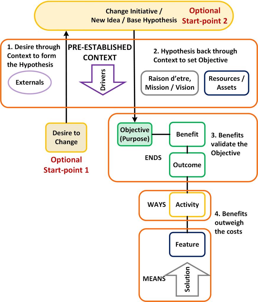
People often talk of chains of cause and effect, however these are more usually cause – effect nets. It’s rarely the case that A links to B links to C in nice neat straight lines. Here is a diagram that shows in very basic terms the connections between means, ways and ends.
Simplest model, the cause effect net between the proposed solution and results
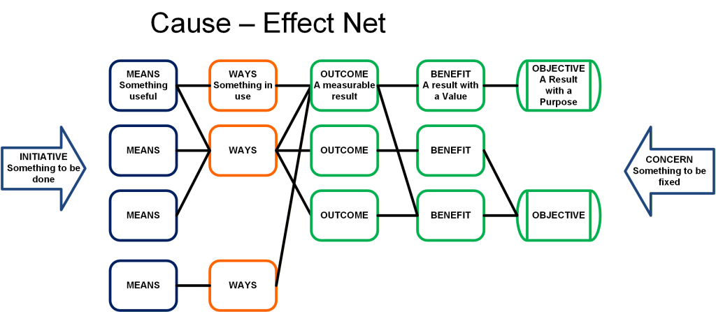
Concerns are things that make us take action. They can be instructions from above, practical problems we want fixed or things we believe ought to be.
The Initiative is what we will do within feasible limits. It has to have boundaries to keep it manageable. This stops us boiling the ocean, eating the elephant, creeping the scope.
We take appropriate resources, use them well and achieve good results for the right people (for whatever we believe are appropriate, good and right in our specific context. After all, decision making is a subjective exercise).
Let’s bring this closer to home for those of us interested in projects and information. Here’s a generic model for any information based project.
An information project, a less simple model
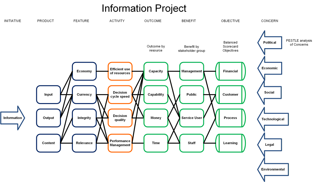
There’s a bit more detail here. The Means are split into Products, the broad topics and their particular Features. For example, Input will cover the processes of getting data and Economy and Currency mean we want the Input to be cheap and up to date. At the other side of the diagram, the Ends are split into Benefits for the various stakeholders and strategic Objectives that the organisation wants, categorised here by Balanced Scorecard.
I haven’t yet found an information project that can’t be overlaid onto these boxes. The connectors may move and not all the boxes will be needed but the general concepts will apply. We get, change and send information in ways that highlight its relevant attributes (cheap, quick, etc) so it is used to best effect for the chosen stakeholders.
Let’s make this generic diagram a bit more specific. Integrated Care Records is a public sector topic that’s pretty popular at the moment so here’s a hypothetical case that ought to work as a broadly applicable example.
Data driven integrated care, a bit more specific
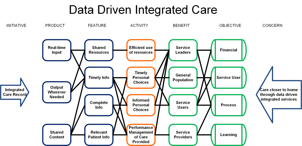
Here, Service Leaders are the people who control the care, e.g. commissioners of services or budget holders. Who they are will depend on the scale of the programme or project in question. Service Providers can be the institutions delivering services, down to individual staff members and again this depends on scale. The Service Users are mostly patients who get direct, personal impact from the care provided. There may be broader societal that impact lands on the general population. They’re often listed as ‘The Community’, ‘The Taxpayer, or ‘UK plc’.
It’s still pretty generic. What happens when we concentrate on one requirement? Someone who commissions care believes an integrated care record can bring more empowerment to service users. The next diagram shows a) why they believe this is a good thing and b) how the record will empower the service user.
A simple model, integrated care to empower service users
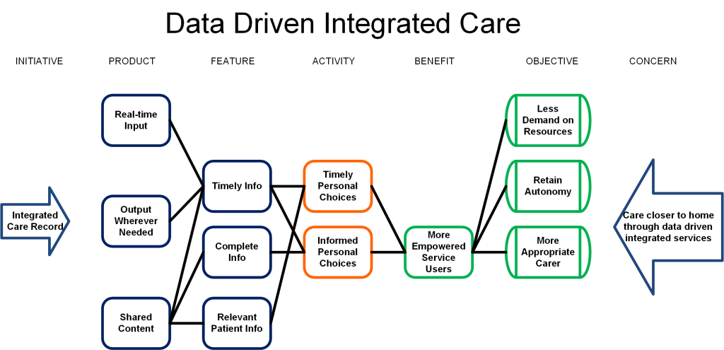
There’s a whole separate discussion to be had on who a project’s actually for and what they really want from it (see Six Dumb Questions). Looking at the objective of ‘Less demand on resources’, it’s pretty clear that the benefit recipient here is the commissioner who’s paying, not the Service Users. We would usually expect Service Users to get some value out of the project but they’re not the reason why this one is happening. The model shows clearly what end we have in mind. This then tests the reasoning of what a good result is and how we will prove it. In this case, wanting less demand on resources means that we will want the Service Users to be more empowered to look after themselves, not more empowered to band together and demand more out of the NHS. The project will have to be planned and managed to ensure this.
One great thing about this sort of model is that it helps you spot the unintended consequences, “If we do this then we get that. But we really don’t want that so let’s step back and see where it went wrong.” Iteration works and the third version of the diagram is usually far better than the first.
We have created a simple model of a complex project. It gives us the opportunity to agree that it’s the right project for the right reasons. It’s certainly better to have the arguments about the project’s purpose at the beginning than argue about its fitness for purpose (which was never really agreed) once most of the money has been spent. When someone asks what it’s all for, we have the makings of a sensible reply.
Try this on one of your own projects. It should trigger some interesting debate.